Latest reviews
· Galileo 2 Starliner V1.1
· Beach Fight D.H.A V2
· Alien Encounter Pinball
· Old Mines (Remake)
· Andy's House 2.0
· Solar Eclipse
· Virtual Reality 2
· Canyonfight
· Wasa arena
· DimensionaL_DrifT.V1
· W@ckAmole
· PRINCESS oF DARKNESS
· Olympians (beta 2)
· Shattered Gorge Mini v2.1
· Mining Dispute
Reviewed by MrLSD
· Beach Fight D.H.A V2
Reviewed by dvl_iac
· Alien Encounter Pinball
Reviewed by dvl_iac
· Old Mines (Remake)
Reviewed by dvl_iac
· Andy's House 2.0
Reviewed by dvl_iac
· Solar Eclipse
Reviewed by dvl_iac
· Virtual Reality 2
Reviewed by dvl_iac
· Canyonfight
Reviewed by Mitzi
· Wasa arena
Reviewed by Mitzi
· DimensionaL_DrifT.V1
Reviewed by kerpal
· W@ckAmole
Reviewed by dvl_iac
· PRINCESS oF DARKNESS
Reviewed by dvl_iac
· Olympians (beta 2)
Reviewed by dvl_iac
· Shattered Gorge Mini v2.1
Reviewed by dvl_iac
· Mining Dispute
Reviewed by dvl_iac
Latest files
· Galileo 2 Starliner V1.1
· RF Game Night 152 Map Pack
· The Pit (Edited)
· RTS A Space Odyssey (Edited...
· Nikki's Bridge Trap (Edited...
· Nikki Ville 3000 (Edited)
· Special Forces (Edited)
· RFGR Hook
· DM Europa One Outpost - No ...
· CTF Europa One Outpost - No...
· DimensionaL_DrifT.V1
· Warlords Pro AR (No Fog)
· Language Packs (En,Fr,De,Ru...
· RF Game Night 151 Map Pack
· rf2.exe Collection
This is a thread where everyone can post their WIP (work-in-progress) maps and mods and receive constructive criticism.
I guess I'll kick it off by showing some screenshots from a map I've been working on recently.
This map was originally made by nick for LEGO_MP as pdmL01: Lava Control 4. It was then ported to Sauerbraten (unreleased) by many of us, and I've remade it in Red Faction.


NOTE: Obviously, as these screenshots are from a map that is still in beta the finished product could still be significantly different.
Comments? Questions? Criticisms?
This map was originally made by nick for LEGO_MP as pdmL01: Lava Control 4. It was then ported to Sauerbraten (unreleased) by many of us, and I've remade it in Red Faction.


NOTE: Obviously, as these screenshots are from a map that is still in beta the finished product could still be significantly different.
Comments? Questions? Criticisms?
Looks cool, the look of the map reminds me of Hykos by Vibes.
The map has changed significantly, and we're ready for testing. I've got a server up named "EVERYBODY JOIN" if you would like to help. 
I am not sure when I will have access to RF.
started a new micromap based on a Garage
Started with a tool box
Yet to add draws with tools
few Powerbuilt badges and few stickers [inserted via decals] that i have on my own toolbox
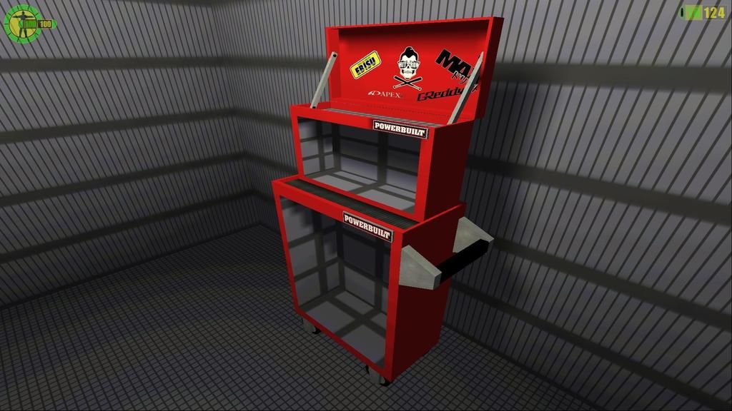
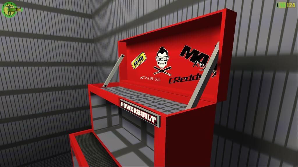
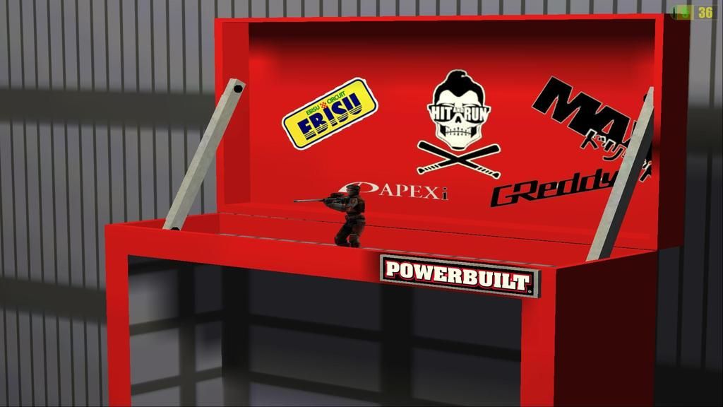
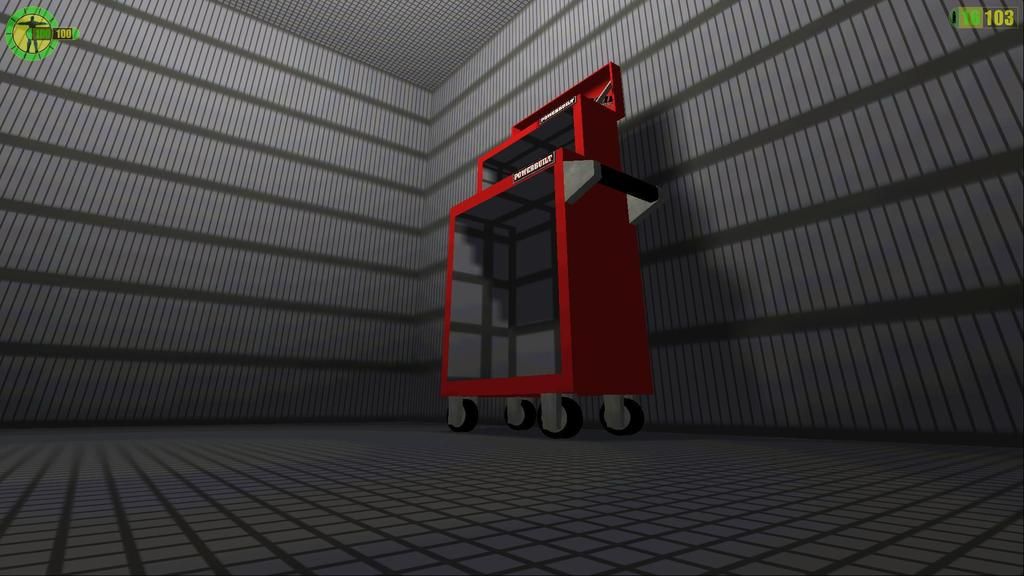
Started with a tool box
Yet to add draws with tools
few Powerbuilt badges and few stickers [inserted via decals] that i have on my own toolbox


Edited by stealthzoar at May 15, 2015, 11:56
Uploaded Map DM-Eastside Lobby
Map was going to be released back in 2009 however never got around to it
Based on "DM01-The Lobby" with an Urban Twist
Not much has been tweeked since the development in 2009 just a few extra weapons added and a secret room
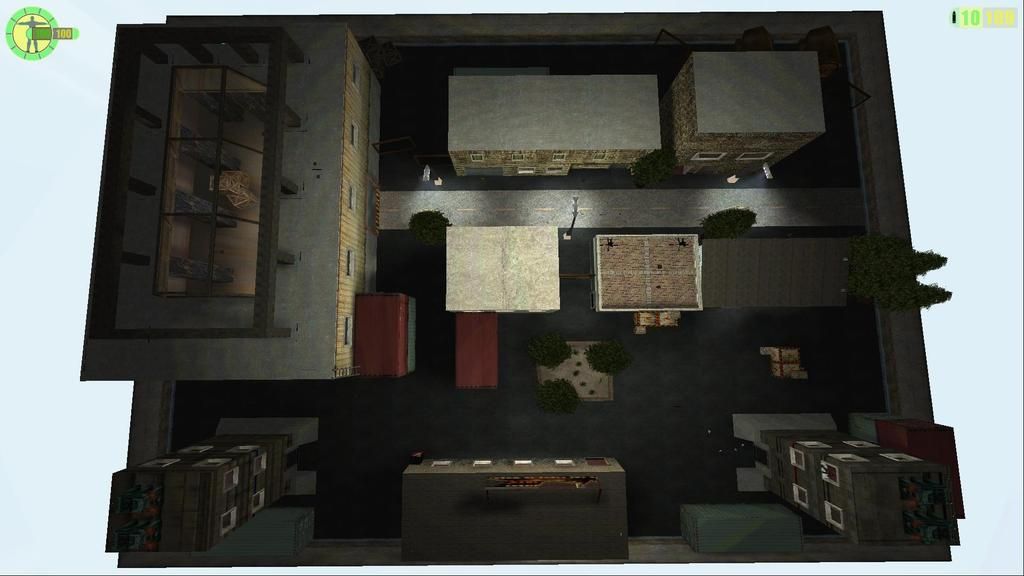
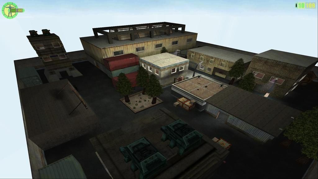
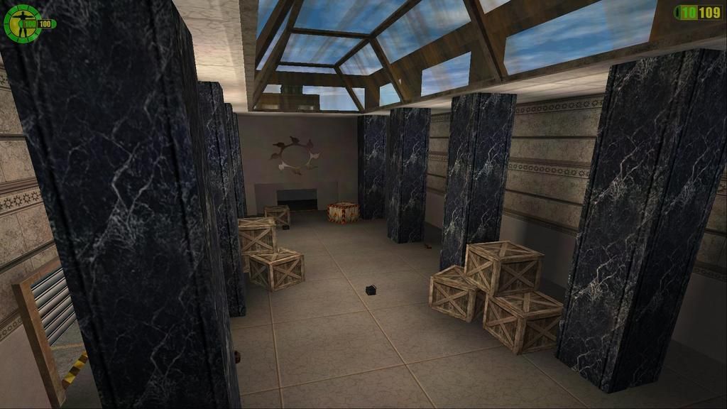
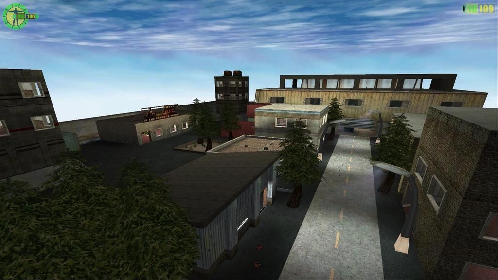
Map was going to be released back in 2009 however never got around to it
Based on "DM01-The Lobby" with an Urban Twist
Not much has been tweeked since the development in 2009 just a few extra weapons added and a secret room


That looks fantastic. Pretty cool idea with The Lobby. Looking forward to play it. 
The lobby map looks pretty neat for me. But ya you'll have to add some minor (not brighter  ) light in the outskirts. It,s too dark to see however overall its perfect .
  No more extra changes.
Quoting Haze202
Quoting SeeLkaDooM94
The lobby map looks pretty neat for me. But ya you'll have to add some minor (not brighter) lights .
But adding lights makes it brighter?
Not brighter enough to make your eyes bleeding , that's what i meant.
i must just have a brighter screen, I feel if i use more lighting it will make it too bright
I do like having a Grunge feeling to city maps like this and usally i will go for dark shadows like this or make the whole map have a midnight purplish tint to it
I do like having a Grunge feeling to city maps like this and usally i will go for dark shadows like this or make the whole map have a midnight purplish tint to it
Quoting stealthzoar
i must just have a brighter screen, I feel if i use more lighting it will make it too bright
I do like having a Grunge feeling to city maps like this and usally i will go for dark shadows like this or make the whole map have a midnight purplish tint to it
I do like having a Grunge feeling to city maps like this and usally i will go for dark shadows like this or make the whole map have a midnight purplish tint to it
Which reminds me i should have a look at some of my old harddrives at some point had a near complete project for the RedDoom mod that had purplish tint to the outdoor areas of the map
saw some of the pictures using the way back machine however links are dead from imageshack :(
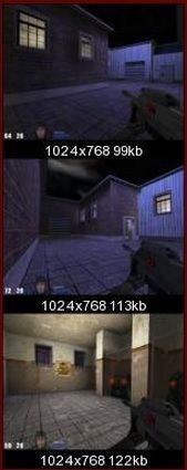
Recently, I've been trying to avoid using dark or "night" lighting in RF wherever possible. Lightmaps in RF can't have true black (I believe either 40, 40, 40 or 28, 28, 28 are the lowest it'll let you go), so darker maps tend to not look quite right.
See my Anubis map for example. The lighting looks way better in the editor after calculating lightmaps, because it displays true black. Load it in-game however, and it just ends up looking really bland and uninteresting.
To each their own, but I feel like brighter lighting works better in this engine.
EDIT: Also, I think your idea for the "Lobby" map is really cool, and the screenshots you've posted for the most part look good. I can't wait to try it out.
I belive my mapping style and lighting is Influenced Heavily on work of SKA Diesel and also RoMeK
Diesels River Requiem (RFU4) is a great example of influence in my night maps
using Purple lighting <40, 40, 100> as his ambient lighting which gave it a nice night feeling then <255, 175, 95> or <255, 205, 5> orange lights to enhance the indoor environments
one of their own i guess
Yeah looks mint in editor however i think the pure blue has let it down slightly? could be wrong however feels very green to me ? i think my monitor might be a tad too bright after playing that map lol
saying that... it does add a nice old mossy Aztec feel to it
Diesels River Requiem (RFU4) is a great example of influence in my night maps
using Purple lighting <40, 40, 100> as his ambient lighting which gave it a nice night feeling then <255, 175, 95> or <255, 205, 5> orange lights to enhance the indoor environments
one of their own i guess
Quoting Goober
Recently, I've been trying to avoid using dark or "night" lighting in RF wherever possible. Lightmaps in RF can't have true black (I believe either 40, 40, 40 or 28, 28, 28 are the lowest it'll let you go), so darker maps tend to not look quite right.
See my Anubis map for example. The lighting looks way better in the editor after calculating lightmaps, because it displays true black. Load it in-game however, and it just ends up looking really bland and uninteresting.
To each their own, but I feel like brighter lighting works better in this engine.
EDIT: Also, I think your idea for the "Lobby" map is really cool, and the screenshots you've posted for the most part look good. I can't wait to try it out.
See my Anubis map for example. The lighting looks way better in the editor after calculating lightmaps, because it displays true black. Load it in-game however, and it just ends up looking really bland and uninteresting.
To each their own, but I feel like brighter lighting works better in this engine.
EDIT: Also, I think your idea for the "Lobby" map is really cool, and the screenshots you've posted for the most part look good. I can't wait to try it out.
Yeah looks mint in editor however i think the pure blue has let it down slightly? could be wrong however feels very green to me ? i think my monitor might be a tad too bright after playing that map lol
saying that... it does add a nice old mossy Aztec feel to it
Edited by stealthzoar at May 17, 2015, 0:24
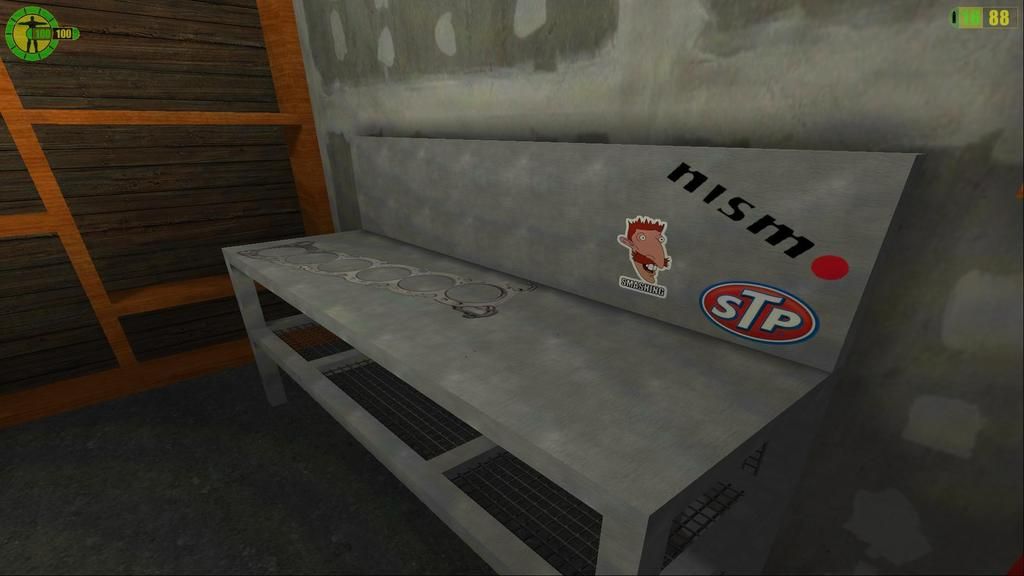
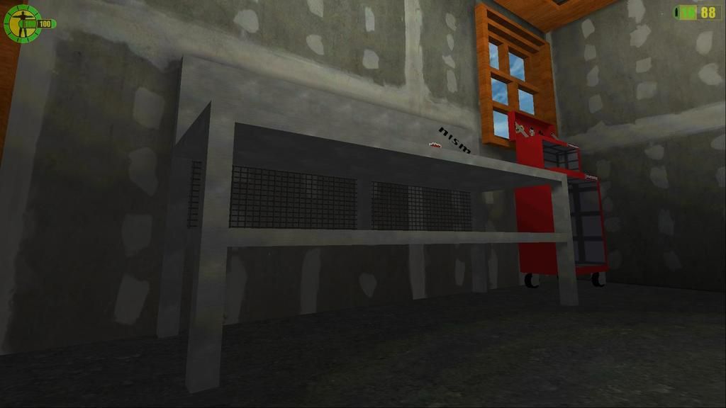
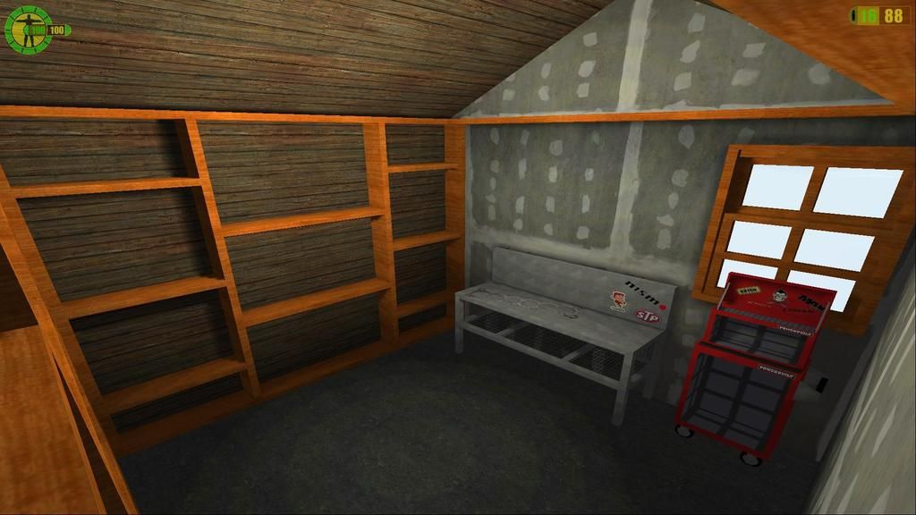
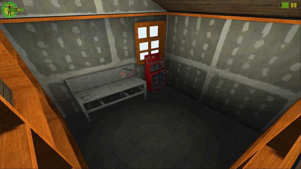
Screenshots from my micro garage map
Have a workbench vice to import in once i can get the movers working correctly rather than the solid brushes disappearing
Work Bench started, More Stickers.... Blowen Head gasket etc....
Basic non detailed window put in...
Wallstuds (wooden beams) bit of texture...
Have to put in ceiling frames and boxes under the workbench etc... starting to take shape


Edited by stealthzoar at May 17, 2015, 7:52
Just finish up your map, and we'll see how it goes in the end. Wouldn't like too many spoilers though :3
Pages: [1 2]

